Paint Gallery
This collection features paintings I've completed either as assignments or personal projects. I like to experiment with color, and enjoy creating vivid, high-contrast pieces.
This section of my portfolio is still developing, as I started painting March of 2025 (not including set painting, which I've done since 2021).
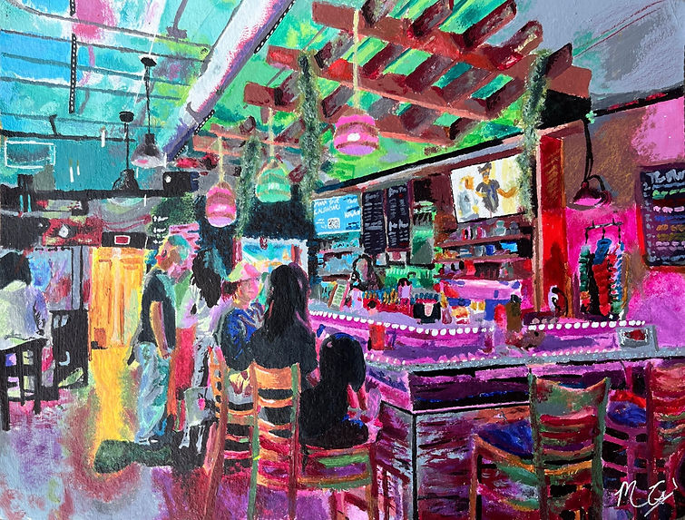
"The Muddy Root"
Press the arrows to click through slides/progress photos.
Artist Statement:
This piece features "The Muddy Root," a study cafe and social hangout right outside of UCF campus. I'd just finished a color theory project and wanted to experiment further with color. This composition was a perfect candidate, featuring several light sources of varying colors, sizes, and brightnesses, all altering the visual color of the objects in the room. I avoided painting items their "true" color and instead painted colors as I saw them, resulting in a vibrant yet well-balanced piece.
FINAL EXAM: color theory painting
Press the arrows to click through slides/progress photos.
Assignment Goals:
This piece was my "final exam" for Design Fundamentals 2D, with the primary focus being color theory. Each of the four sections features different color relationships. From the outside inward, they are: monochromatic, tertiary colors, analogous, and complementary. We were only provided white, black, and primary colors, so we had to mix our own paints. Additionally, we needed to juxtapose an organic image (in my case, a fruit platter) with something industrial (in my case, the John C. Hitt Library). This was my first real painting, and I thoroughly enjoyed it.
Artist Statement:
To accentuate the "organic versus industrial" component of the assignment, I chose the John C. Hitt library for its multitude of rectangular windows, lights, and other square elements. Though it was implied that we would choose a type of flower for our "organic" image, I chose a fruit platter to both stand out and provide greater color diversity. I chose each color palette intentionally so that the sections contrast with each other; this way, the implied lines between sections are more distinct, and they don't blend together or muddle at all. We had to mix our own colors, as we were only provided white, black, and primary colors; to keep colors consistent, I started light and worked darker. This way, I could mix a color and gradually add black to darken it. Additionally, I could take some of that paint and add more white to it to desaturate it.